The Glass Ceiling: How to Tame Apple's Liquid Interface
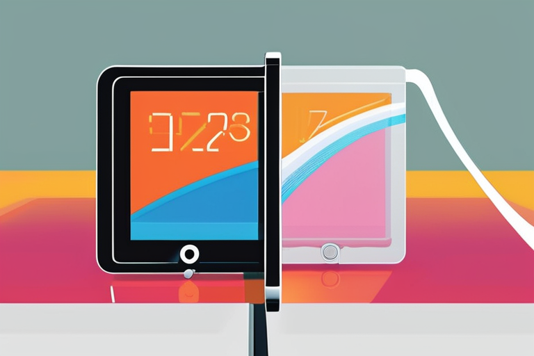
As I booted up my MacBook for the first time with macOS 26, I was greeted by a sea of transparent blobs and morphing animations. It was like staring into a kaleidoscope – mesmerizing at first, but soon overwhelming. The new Liquid Glass interface, touted as a revolutionary redesign, had me questioning whether Apple's focus on aesthetics over usability was worth the trade-off.
For many users, the answer is no. Designers, accessibility advocates, and even some Apple enthusiasts have spoken out against the interface's lack of clarity and readability. Older devices struggle to keep up with the graphically intensive design, slowing down performance and frustrating users. But what about those who love the new look? Can they still get the best of both worlds – style and substance?
To find out, I dove into the settings, searching for a way to tame the Liquid Glass beast. After hours of tinkering, I discovered that while there's no complete reversal to the old interface, there are tweaks to be made. By adjusting a few key settings, you can reduce transparency, increase readability, and even speed up your device.
A Brief History of Interface Evolution
The Liquid Glass design is the culmination of Apple's efforts to modernize its user experience. With each new iteration, the company has pushed the boundaries of what's possible on screen. But with great power comes great responsibility – or so it seems. The latest interface has sparked a heated debate about the role of aesthetics in usability.
"I love the new design," says Sarah, a graphic designer who's worked extensively with Apple products. "It's fresh and exciting, but I can see how it might be overwhelming for some users." She notes that the transparency feature, while visually appealing, can make text harder to read at times.
On the other hand, accessibility advocate Rachel argues that the new interface is a step backward in terms of clarity and readability. "As someone who relies on screen readers, I've noticed a significant decrease in usability," she says. "The animations are distracting and make it difficult for me to navigate."
Taming the Liquid Glass Beast
So, how can you balance style with substance? Here are some settings tweaks to get you started:
1. Reduce Transparency: Hidden within the Accessibility settings is a toggle to Reduce Transparency. Flipping this switch will make windows and other interface elements less see-through.
2. Adjust Display Settings: On your Mac, open System Settings > Accessibility > Display. You'll find the toggle for reducing transparency. Toggle it on, and you'll notice the menu bar is whole again.
3. Customize Animations: In the Display settings, you can also adjust animation speed and style to suit your preferences.
While these tweaks won't completely revert your interface back to its former glory, they'll help you find a balance between aesthetics and usability.
The Future of Interface Design
As technology continues to evolve, one thing is clear: user experience will remain at the forefront of innovation. Apple's Liquid Glass design may be polarizing, but it marks an important milestone in the ongoing conversation about interface design.
"We're not just talking about aesthetics; we're talking about accessibility and usability," says Rachel. "The next generation of interfaces needs to prioritize both style and substance."
For now, users will have to navigate the complexities of Apple's new design. But with these tweaks and a willingness to experiment, you can find a middle ground that works for you.
As I closed my laptop, the transparent blobs still danced on screen, but I felt more in control. The Liquid Glass interface may be here to stay, but with a little tweaking, it won't dominate your experience.
*Based on reporting by Wired.*
Breaking Free from Liquid Glass: Taming Apple's Revolutionary Interface
1
0